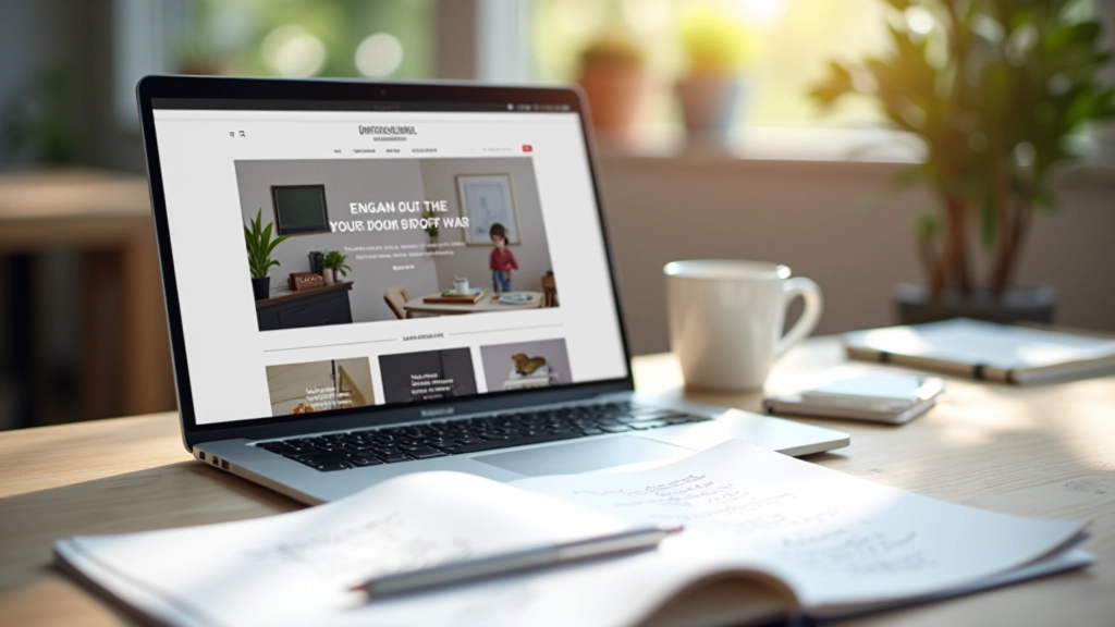
What Makes a Portfolio Stand Out to Clients
The three elements every designer needs: clear navigation, strong visual hierarchy, and work that tells a story. Learn what actually catches client attention.
Read ArticleStop memorizing arbitrary guidelines. Here’s what typography really does and why it matters for your portfolio.
Most designers approach typography like it’s a list of rules to follow. Don’t mix more than three typefaces. Keep line height between 1.4 and 1.6. Make your headings 2–3 times larger than body text. But here’s the thing — these aren’t laws carved in stone. They’re patterns that emerged because they actually work.
Typography isn’t decoration. It’s how your portfolio communicates before someone even reads a word. The way you set your headline, space your paragraphs, and choose your fonts tells viewers whether you’re serious about design or just going through the motions. That matters when you’re trying to land clients or impress art directors.
You’ve probably heard that typography establishes hierarchy. But what does that actually mean? It means your readers should instantly understand what’s most important on the page. Your headline grabs attention. Subheadings break up sections. Body text delivers the details. Without clear hierarchy, everything looks equally important — and that means nothing stands out.
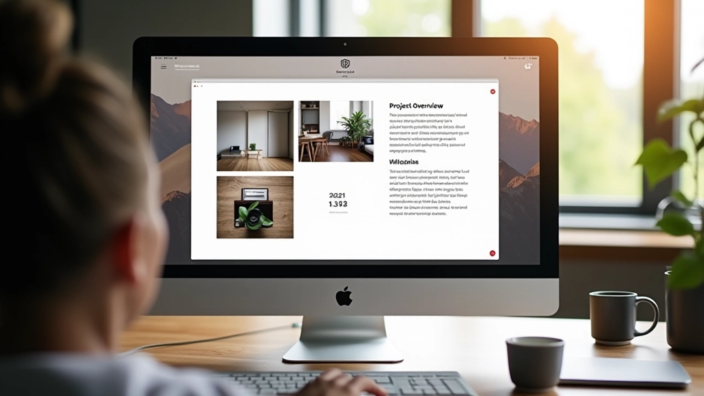
In your portfolio, hierarchy does the heavy lifting. A potential client lands on your case study page and needs to understand your project in seconds. They’ll scan the headline, skim subheadings, and maybe read a paragraph or two. If you’ve set this up right — with clear size, weight, and spacing differences — they’ll follow your story. If not, they’ll bounce.
Start with this: your H1 should be noticeably larger than your H2, which should be noticeably larger than your body text. Not just a little larger — distinctly larger. We’re talking 28–32px for body, 48–56px for H2, and 64–80px for H1. These aren’t magic numbers, but they create real visual separation.
Here’s what separates portfolios that feel premium from ones that feel amateur: spacing. Not just between lines, though that matters too. I’m talking about the space around everything — between paragraphs, between sections, between your text and the edge of its container.
Line height (the space between lines of text) should be around 1.5 to 1.6 for body text. Why? Because your eye needs breathing room to follow from the end of one line to the beginning of the next. Too tight, and reading feels claustrophobic. Too loose, and the text loses cohesion. This isn’t subjective — it’s about how your brain processes visual information.
Letter spacing (tracking) gets less attention, but it’s equally important. Most fonts come with decent built-in spacing, but headlines often need a little breathing room. Bump up letter-spacing by 0.05em or 0.1em on your H1, and you’ll instantly feel the difference. It makes headlines feel more intentional, more designed.
The real power of typography comes from contrast. Different weights, sizes, and styles working together to create visual interest and guide attention.
Use one sans-serif for everything and you’ve missed an opportunity. Try pairing a bold, geometric sans-serif headline with a neutral, readable sans-serif for body text. Or combine a serif headline with a clean sans-serif body. The contrast between them creates visual rhythm — it’s like the difference between a monotone conversation and one with natural inflection.
Weight variation does the same thing. A 700-weight headline paired with 400-weight body text creates immediate contrast. If you really want to push it, use 600 or 700 for subheadings. Your eye will move through the hierarchy almost automatically, without any conscious effort from the reader.
Color contrast matters too, especially in dark mode. We’re seeing more portfolios with dark backgrounds, and that means your text needs real contrast to stay readable. Aim for at least a 4.5:1 ratio between text and background. It’s not just accessible — it looks sharper and more intentional.
The typography world will tell you there are infinite typefaces. That’s true, but it’s also paralyzing. Here’s what actually matters for your portfolio: pick one typeface you like for headlines, one for body text. That’s it. Done.
For body text, stick with something proven and readable. Helvetica, Roboto, Inter, System UI fonts — these work because they’re neutral and legible at small sizes. You’re not trying to win awards for your font choice. You’re trying to make your work readable and your portfolio professional.
Your headline font has more room to express personality. Maybe you use something with character — a geometric sans like Montserrat, a clean serif like Playfair Display, or something with more attitude. Just make sure it’s readable at the size you’re using it. If your headline is so stylized that people struggle to read it, you’ve defeated the purpose.
Set line-height to 1.5 or 1.6 for body text. This creates comfortable reading without feeling spacious. Test it yourself — you’ll feel the difference immediately.
If your body text is 16px, make your H2 about 28–32px and your H1 about 48–64px. These ratios feel natural to the human eye and create real visual separation.
Two typefaces maximum. One for headlines, one for body. Mixing three or more looks chaotic unless you really know what you’re doing — and most designers don’t.
Add 0.05em to 0.1em of letter-spacing to H1 and H2. It instantly makes headlines feel more intentional and gives them breathing room.
Make your hierarchy visually obvious. Different sizes, weights, and colors working together. If your reader has to think about what’s important, you’ve lost them.
Don’t be afraid of empty space. Generous margins and padding around text blocks make everything feel more premium and easier to scan.
Here’s the thing about typography rules: they exist because they work. Not because some design authority decided to make your life difficult. Line height recommendations come from readability research. Size ratios exist because they feel natural. Weight contrast works because your brain processes visual hierarchy instantly.
But rules are also meant to be understood, not just followed blindly. Once you understand *why* line height matters, you can adjust it. Once you grasp hierarchy, you can push contrast further if your design calls for it. The best typography doesn’t feel like someone followed a rulebook — it feels intentional.
Your portfolio is your first impression. The way you handle typography says something about you as a designer. It says whether you sweat the details, whether you care about readability, whether you’ve thought through the experience of viewing your work. That matters. More than you might think.

This article provides general guidance on typography principles and design practices. Typography best practices can vary depending on your specific project, audience, and design context. While the principles discussed here are grounded in readability research and design fundamentals, every project is unique. Test these recommendations in your own work and adjust based on what works for your specific situation. Typography is both art and science — the rules provide a foundation, but your own judgment and testing matter equally.