
What Makes a Portfolio Stand Out to Clients
The three elements every designer needs: clear navigation, strong visual hierarchy, and projects that show your actual process — not just finished work.
Read MoreLearn how creative professionals in Canada are showcasing their best work online. From design fundamentals to technical implementation, we’ve got everything you need to create a portfolio that opens doors.

Explore practical guides and insights on creating a portfolio that showcases your work effectively.
The three elements every designer needs: clear navigation, strong visual hierarchy, and projects that show your actual process — not just finished work.
Read More
We tested five different menu styles. Here’s which ones actually work — and why the most beautiful navigation is the one people don’t have to think about.
Read More
Don’t just pick fonts that look nice. Learn the three pairing rules that work every time, and why they matter more than you’d think for your portfolio’s credibility.
Read More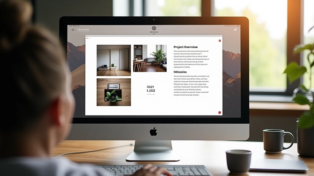
Your project descriptions matter as much as the images. We’ll show you how to explain your thinking in a way that feels genuine and keeps clients reading.
Read MoreWhether you’re based in Toronto, Vancouver, or Montreal, these fundamentals apply to every portfolio. They’re not trendy — they’re timeless.
Clients want to understand how you think. Don’t just show the final result — include sketches, iterations, or brief explanations of your decisions. It’s what separates portfolios from lookbooks.
A beautiful portfolio that takes 8 seconds to load loses people. Optimize images, minimize animations, and keep file sizes small. Your design means nothing if nobody waits to see it.
Resist the urge to over-design your portfolio. Big bold fonts, elaborate animations, and trendy layouts distract from what matters — your actual projects. Simple often wins.
More than half your visitors are on phones. Your portfolio needs to look as good on mobile as it does on desktop — same images, same hierarchy, same impact.
What works for a photographer doesn’t work for a developer. Here’s how to adapt the fundamentals to your specific field.
You need space for your images to breathe. Large thumbnails, generous padding, and minimal text. Let the work dominate. Showcase 8-12 of your strongest pieces rather than everything you’ve ever done.
Tell the story behind your designs. Include project context, user problems you solved, and results when possible. Screenshots alone aren’t enough — people want to understand your thinking.
Gallery-focused layout with minimal distractions. High-quality image optimization is essential — this is where site speed directly impacts your credibility. Consider a grid or masonry layout that showcases variety.
Show working examples. Live demos, GitHub links, and functional projects matter more than pretty screenshots. Include technologies used, and don’t forget to explain the problems your code actually solved.