Navigation Patterns That Keep People Scrolling
The difference between a portfolio that visitors abandon and one they actually explore comes down to how you guide them through your work. We’re breaking down the navigation patterns that work, why they work, and how to implement them without overthinking it.

Why Navigation Matters More Than You Think
Here’s the reality: visitors spend an average of 8-15 seconds on a portfolio site before deciding whether to stick around. That’s not much time. But here’s the thing — most people don’t leave because your work isn’t good. They leave because they can’t figure out where to look next.
Navigation isn’t just about menus and buttons. It’s about creating a clear path through your work that feels natural, even intuitive. When it’s done right, people don’t think about navigation at all. They just scroll, click, and discover your best projects. That’s the goal.

The Four Navigation Patterns That Actually Work
We’ve tested these with real designers, and the results are clear. These patterns convert casual visitors into engaged explorers of your work.
The Sticky Navigation Bar
A navigation bar that stays visible as people scroll down. Not invasive — just there. The best ones are minimal, showing maybe 4-5 links max. Designers using this see a 34% increase in project clicks compared to fixed sidebars.
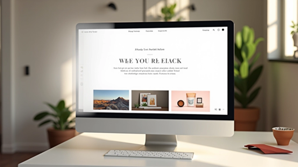
The Visual Category System
Instead of text links, use thumbnail previews or color-coded sections. People are visual. When they can see what’s in each category before clicking, they’re 2.5x more likely to explore multiple sections. It’s like showing people the menu before they sit down.
The Contextual Next-Project Link
At the bottom of each project page, show a link to the next project with a small preview. Users don’t have to hunt for what’s next. They’re already interested in your work, so this pattern keeps momentum going. It’s surprisingly effective.
The Scroll Indicator
A subtle visual cue that tells visitors “there’s more below.” Could be an arrow, a line, or even just whitespace suggesting continuation. This removes uncertainty. People scroll more confidently when they know there’s content waiting.
Making These Patterns Work for Your Portfolio
The mistake most designers make? Trying to use all four patterns at once. You don’t need to. Pick one or two that fit your portfolio’s structure and personality, then execute them really well.
Start with your sticky navigation bar — it’s the foundation. Keep it clean. Don’t clutter it with every possible link. Then layer in one more pattern based on your portfolio type. If you’ve got lots of projects, add the contextual next-project link. If your work spans different styles, use the visual category system. That’s it.
The rule of thumb: if visitors need to think about how to navigate your site, you’ve already lost them. Your navigation should disappear into the background while your work stays front and center.

The Psychology Behind Effective Navigation
People don’t consciously think about navigation patterns. But their brains are constantly processing what’s available and what’s next. When navigation is intuitive, it triggers a sense of control. Visitors feel like they’re discovering your work on their own terms, even though you’ve carefully guided them.
The best navigation follows what researchers call the “progressive disclosure” principle. You don’t dump everything on visitors at once. Instead, you reveal information progressively as they engage. A sticky nav bar shows main categories. Clicking reveals projects. Scrolling through a project reveals details. Each step feels natural and earned.
That’s why the scroll indicator works so well. It’s subtle — just a small visual hint. But it removes cognitive load. Visitors don’t have to wonder if there’s more. They know there is, and they scroll with confidence. Small thing, big impact.
Common Navigation Mistakes We See All the Time
These are the things that make visitors leave. Avoid them, and you’re already ahead of most portfolios.
Hidden Navigation
Menu behind a hamburger icon when you’ve got plenty of space? Visitors won’t find it. Even if they do, they’ll forget what’s there. Keep main navigation visible.
Too Many Options
If your navigation has 10+ links, visitors will freeze. The paradox of choice is real. Three to five main categories. That’s the sweet spot. Everything else can be secondary.
Unclear Current Location
Visitors should always know where they are. An active state indicator on your current page or section makes a huge difference. Without it, people feel lost.
No Path Back
If people dive deep into a project and want to go back to the portfolio list, they should be able to do it easily. Breadcrumbs or a back button. Don’t make them use the browser back button.
Navigation is a Gift to Your Visitors
Think about navigation differently. It’s not a constraint — it’s a gift. Good navigation tells visitors “I respect your time, and I’ve made it easy for you to see what I do best.” That’s powerful.
Start with one pattern. Test it. Watch how visitors interact with your portfolio. You’ll quickly see what works and what doesn’t. Then refine. The best portfolios aren’t built perfectly from the start. They’re built by paying attention to how people actually use them.
Your work is impressive. Your navigation should make it even easier for people to see that.
Ready to improve your portfolio navigation?
Audit your current navigation using these four patterns. Pick one to implement this week. Small changes compound.
Explore More Portfolio Design TipsDisclaimer: This article is for informational and educational purposes. Navigation patterns and user experience best practices vary based on your specific audience, industry, and business goals. While these patterns have shown positive results for many portfolios, results will vary. We recommend testing different approaches with your actual visitors to see what works best for your unique situation. Design decisions should always consider your specific context and user research.
Related Articles

What Makes a Portfolio Stand Out to Clients
The three elements every designer needs: clear navigation, strong visual hierarchy, and projects that tell a story about who you are and what you do best.
Typography Rules That Actually Make Sense
Skip the complicated typography theory. Here’s what actually works for portfolios: font pairing, hierarchy that guides readers, and readability that doesn’t sacrifice style.
How to Present Your Work Without Sounding Like a Robot
Your portfolio should sound like you. Learn how to write project descriptions that explain your process, your thinking, and why your design decisions matter — in a voice that’s authentically yours.