Navigation Patterns That Keep People Scrolling
How to structure your portfolio navigation so visitors actually find what they’re looking for.
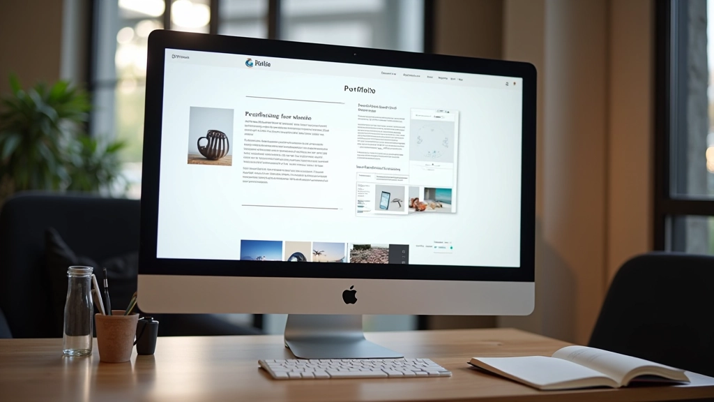
Read ArticleThe three elements every designer needs: clear navigation, strong visual hierarchy, and projects that show your actual process — not just finished work.

Your portfolio is basically a conversation with someone who’s never met you. They’re scrolling through in maybe five minutes, trying to figure out if you’re the right fit for their project. You won’t get a second chance to make that impression.
Here’s the thing: most portfolios fail because they’re all polish and no substance. Beautiful finished pieces are great, but clients actually want to see the thinking behind them. They’re hiring a problem-solver, not just someone who makes things look good. That distinction matters more than you’d think.
We’re going to walk through what actually separates portfolios that land clients from the ones that get lost in the shuffle. These aren’t fancy design principles — they’re practical decisions that show you understand how people actually browse your work.
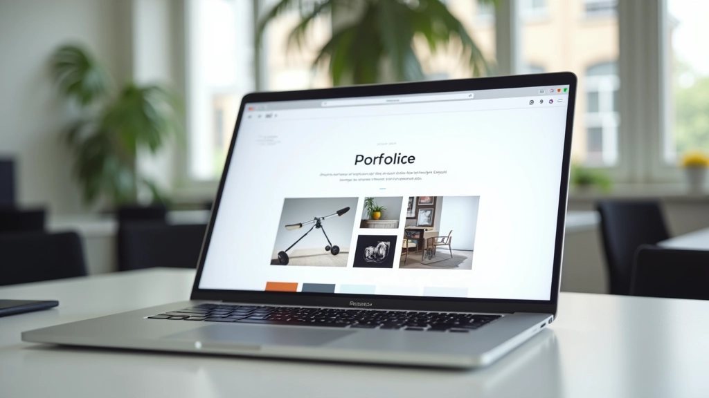
The first thing clients notice isn’t your design skills — it’s whether they can actually find what they’re looking for. If someone’s got to hunt through your site to see your best work, you’ve already lost them.
Clear navigation means a few things. First, your categories should match how clients think about work, not how you think about it. Instead of “Digital” and “Print,” consider “Brand Identity,” “Web Design,” “Illustration” — things that mean something to someone hiring you.
Second, your featured work should be visible immediately. Don’t bury your strongest pieces three clicks deep. Put them on the homepage. Make it obvious what you do best. Most visitors won’t scroll past the fold if they don’t see something that grabs them right away.
Third, navigation menus should be straightforward. One level deep is ideal. Drop-down menus work if you’re careful, but they’re often overcomplicated. Your portfolio isn’t an e-commerce site — keep it simple. Most successful portfolios have between 4-7 main navigation items.
“Clients spend about 72 seconds on average looking at portfolios. That’s not much time to figure out how your site works.”
Visual hierarchy is just fancy language for “make the important stuff obvious.” On your portfolio, this means your best work should stand out. Not just because it’s good, but because of how it’s presented.
Size matters here. Your strongest projects should take up more screen space. If everything’s the same size, nothing stands out. You’re essentially saying “all my work is equally good,” which clients don’t really believe. They want to know what you’re proudest of.
Color and contrast play a role too. If your whole portfolio is muted grays and blacks, a pop of color draws attention. If you’re using color throughout, restraint becomes the contrast. The principle is the same: guide people’s eyes to what matters.
Typography hierarchy works the same way. Your project titles should be larger than descriptions. Descriptions larger than metadata. This creates a visual roadmap that doesn’t require thinking. People scan portfolios — they don’t read every word. Good hierarchy lets them understand your work by looking.
Don’t confuse busy with visual hierarchy. You’re not trying to cram everything into view. You’re strategically choosing what’s emphasized and what’s supporting information. This discipline is what separates portfolios that feel premium from ones that feel scattered.
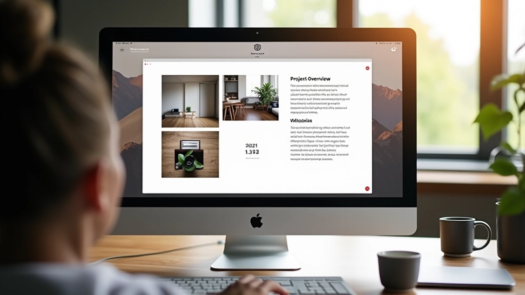
Here’s what separates portfolios that land high-paying clients from ones that don’t: most designers only show finished work. Clients see the end product and think “cool, but how’d you get there?”
When you include your process, you’re showing thinking. You’re demonstrating that you didn’t just make something pretty — you solved a problem. You did research. You iterated. You made decisions based on strategy, not just aesthetics.
This doesn’t mean showing every sketch or every version. Pick 3-5 key moments in your process for your featured projects. Show the initial concept. Show an iteration where you changed direction and why. Show the final result. Include brief captions explaining your thinking.
Clients who hire for substantial projects want to understand how you work. They’re imagining collaborating with you for weeks or months. When they see your process, they’re reassured that you’re methodical, not just talented. That matters more than you’d think — especially for bigger budgets.
Even 2-3 projects with process shown beats 12 projects with only finished work. Quality of presentation builds confidence. Quantity just exhausts people.
“Clients don’t hire based on what you made. They hire based on whether they believe you can solve their specific problem.”
Use this to audit what you’ve got right now
Someone who’s never seen your site before can find your best work in under 30 seconds.
Your 3-5 strongest projects are featured prominently. They’re larger, higher quality images, better positioning.
At least your featured work shows 3-5 steps of your thinking. Why you made decisions, not just what you made.
Project titles are noticeably larger than descriptions. Descriptions larger than metadata. Eyes know where to look.
Images are optimized. Site loads in under 3 seconds on a decent connection. Speed affects how people perceive quality.
You’ve tested your portfolio on a phone. Navigation works. Images scale properly. It doesn’t feel cramped.
Don’t just list what you made. Explain the challenge, your approach, and the result. Two to three sentences is plenty. People want to understand your thinking.
All your project images should have a similar feel. Same lighting approach, same scale, same quality level. Consistency reads as professionalism.
People hire based on relevant experience. If you’ve worked with startups, say so. If you specialize in nonprofits, make it visible. This helps the right clients find you.
Did a rebrand increase client sales? Did a website redesign improve conversion rates? Include these metrics if you have them. Numbers are credible.

You’re not going to land every project that comes your way. But a thoughtful portfolio significantly increases your odds with the ones that matter. Clear navigation, smart visual hierarchy, and visible process — these three things build confidence.
Clients are busy. They’re looking at multiple designers. Your portfolio needs to make their decision easy. It should communicate instantly that you understand their type of work and that you’ve got a thoughtful approach to solving problems.
The good news? You don’t need a perfect portfolio. You just need a clear one that shows thinking. Most designers compete on aesthetics. You’re competing on communication. That’s a much better position.
Spend a few hours this week auditing your portfolio against the checklist above. Pick one thing to improve. Small improvements compound. In a few months, you’ll have something that actually converts interested visitors into paying clients.
Start with your navigation. Get that right, and everything else becomes easier.
Explore More ResourcesThis article provides educational information about portfolio design principles and best practices. The recommendations are based on common industry standards and user experience principles. Every designer’s situation is different — what works best depends on your specific niche, client base, and the type of work you do. Consider these guidelines as starting points, not absolute rules. Your unique perspective and approach matter more than following any single formula.